Before you start reading, I would like to start by saying that I did not always have an appreciation for color and how it impacts my life. Growing up, I really didn’t care what color I wore or surrounded myself with (As long as it wasn’t pink!). Through the years I spent at college and learning how to oil paint, I learned the true importance of color and how it’s strategically used all around us.
Different industries will utilize different colors to get their audience (us) to feel a certain way. Let me explain…
Are you Feeling Hungry?
Did you know that the restaurant industry strategically uses colors like red, yellow, and blue or even a combination of the 3 colors in their branding? For example, major brands such as Burger King, McDonalds, and Arby’s use these colors in their logos, commercials, packaging, and advertising to evoke certain emotions within their audience.
“But Slink, why would they use those colors?” I’m glad you asked.
Red is a direct and in your face. It makes you stop and look at something, and often stands out the most out of all the other colors. (Hence why stop signs are red.)
Yellow represents calm and comfort. Think of the sun and how people are happier on a sunny day vs a cloud day.
A good example of this color combination would be McDonalds. They use red to make you notice their golden arches glowing in the distance, and yellow to evoke a happy, positive feeling. Maybe that’s why the thought of McDonalds fries makes me happy…
Sports Teams Use the Color Theory, too?
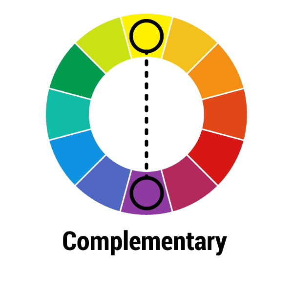
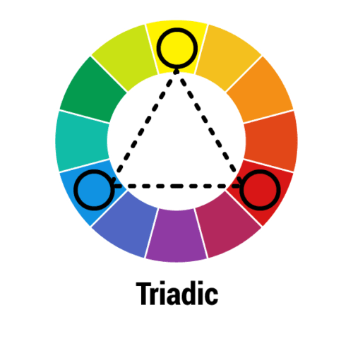
Yes! Have you ever noticed that most sport teams are branded with complementary colors? Think of major teams like the Minnesota Vikings or the Los Angeles Lakers. Their colors are both purple and gold, two complimentary colors placed on opposite sides of the color wheel.
“But what’s so important about complementary colors…?”
Well, complementary colors have the highest contrast when placed next to each other. Sports teams use these colors to stand out on fields, courts, rinks (you name it!) for audience members watching from high up in the bleachers, and to catch TV attention when broadcasted.
50 Shades of… Blue?
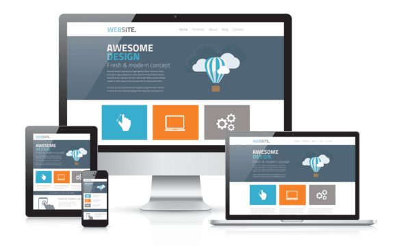
Just like the restaurant industry, technology fields have a similar color pallet with each other. Have you ever noticed that a lot of technology companies will use blue or a cool color palette in their branding? They do this to evoke feelings of trust, confidence, and intelligence.
Blue in particular is a calming color. For example, think of water and how many people go to the beach, or lake for a vacation so they can relax. Technology companies use blue to evoke a sense of trustworthiness, and to entice their audience to feel relaxed about their (often complicated) products.
A World Full of Color
Often times, we take color for granted and don’t even realize how much it impacts our lives and spending habits. Whether you’re painting your laundry room a light shade of blue for a fresh new look, or buying a new, colorful set of clothes that make you feel like a whole new person, color is a powerful tool!
Color brings so much joy to my life, and I hope that I’ve expanded your color pallet to feel joy, too! Ever want to meet up or chat virtually about which color range is right for you or your business?