There is a rapid rise in mobile browsing and changing screen sizes. Designers and developers have become accustomed to making their creations adapt to a user’s device. Recently, while researching design trends, the concept of a “responsive logo” presented itself. I found myself fascinated by article after article outlining the need for responsive logos. (Check out this case study done by London designer, Joe Harrison, for a visual of responsive designs. Resize your browser and watch the magic.)
So, what exactly is a responsive logo?
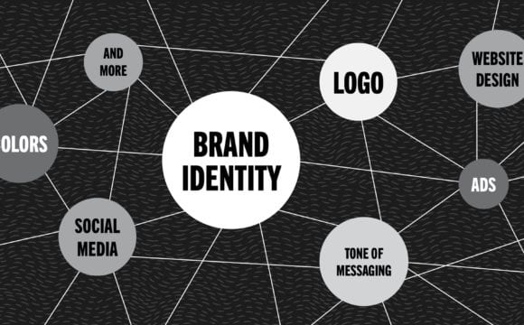
A responsive logo is altered to meet a user’s demands. For example, a mobile device. The designer would preemptively remove elements or details from a logo to make it more legibly displayed on a variety of devices. This allows a logo to better entertain a variety of screen sizes without compromising overall consistency.
 The seemingly taboo concept of tailoring a logo to fit various platforms opposes the conventional mindset. Typically, an identity should rigidly conform to brand guidelines. A user must see the same logo in the grocery store as they would on their TV. How else would we build brand recognition, right? Interestingly enough, many articles categorize this thinking as archaic. Noting that this mindset may have worked prior to the digital age, but brand recognition has become second nature to most consumers. More often than not, a full icon is not necessary for a brand to be recognized. This is where the argument really digs in.
As logos shrink to mobile size, the design loses its nuances. Honestly, you need a magnifying glass the size of Texas to uncover those tiny details a designer painstakingly perfects. Or you know, just read the company’s name. This makes me wonder, “If companies are demanding their websites be responsive, why aren’t their logos?”
Do I need a responsive logo?
Speaking from a pure design perspective, in their infancy, logos aren’t meant for the world of responsive design. A logo’s purpose is to establish the look, feel, and voice of a company. As designers, we hesitate to stray too far from the established guidelines because we want to create a connection with consumers. We want them to know the icon or typeface from a mile away in their sleep. What happens once the company’s logo becomes recognizable? Does removing portions of a logo, that would otherwise be illegible on smaller screens, seem logical?
As swaying as many of the articles are, responsive logos are not for every company. Much like a logo is unique to its company, whether or not a logo practice responsiveness should be considered on a case by case basis.
Do you think your logo should be responsive? We can help!

A natural-born leader who founded Tulip Tree Marketing with the intention of providing custom solutions to business leaders with unmatched experience, creativity, and passion. Her innate ability to maintain a fast-paced environment brewing with innovation and the highest of standards is one of the many reasons her team is considered the best talent in the industry.